Tracking System Implementation
My goal is to gradually automate the process of measuring biomarkers, logging relevant variables, organizing all this data, and analyzing it as efficiently as possible.
In the following figure, you can see the current state of the personal tracking system I have developed:
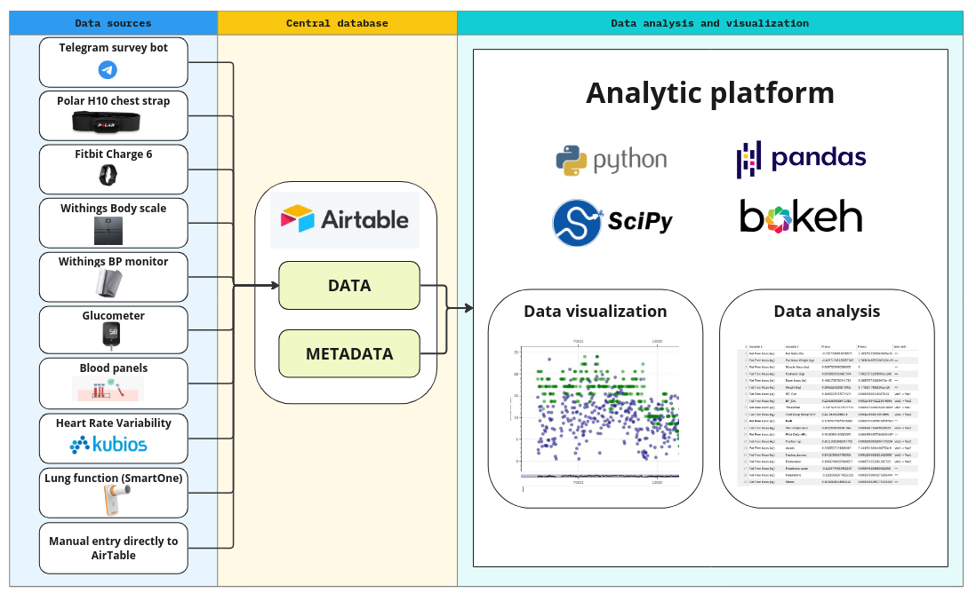
As shown, all data sources feed into a central database, where they are enriched with metadata. The analytical platform can then access this data through a unified interface. The system’s design prioritizes minimizing new code development while maximizing flexibility, allowing for easy integration of new data sources. At the central database level, all data is standardized into a unified format, enabling efficient implementation of the analytical platform.
One key simplification I’ve made is assuming that each variable is recorded at most once per day. While this is a reasonable assumption for tracking long-term processes relevant to longevity, it does limit the platform’s use in other contexts. However, this greatly simplifies the data representation—all the data is essentially stored in one large table, with rows representing days and columns representing the tracked variables. It’s worth noting that the table has many ‘missing’ values, as certain variables (e.g., blood tests) are not recorded daily.
Let’s now dive deeper into each of the system’s components.
Data Sources and Automated Data Feeds
Telegram surveys
I’ve developed a simple Telegram bot that sends pre-defined surveys to a Telegram channel at specified times each day (or on selected days, based on the configuration). For example, every morning I receive a survey to assess my subjective sleep quality, which takes about a minute to complete.
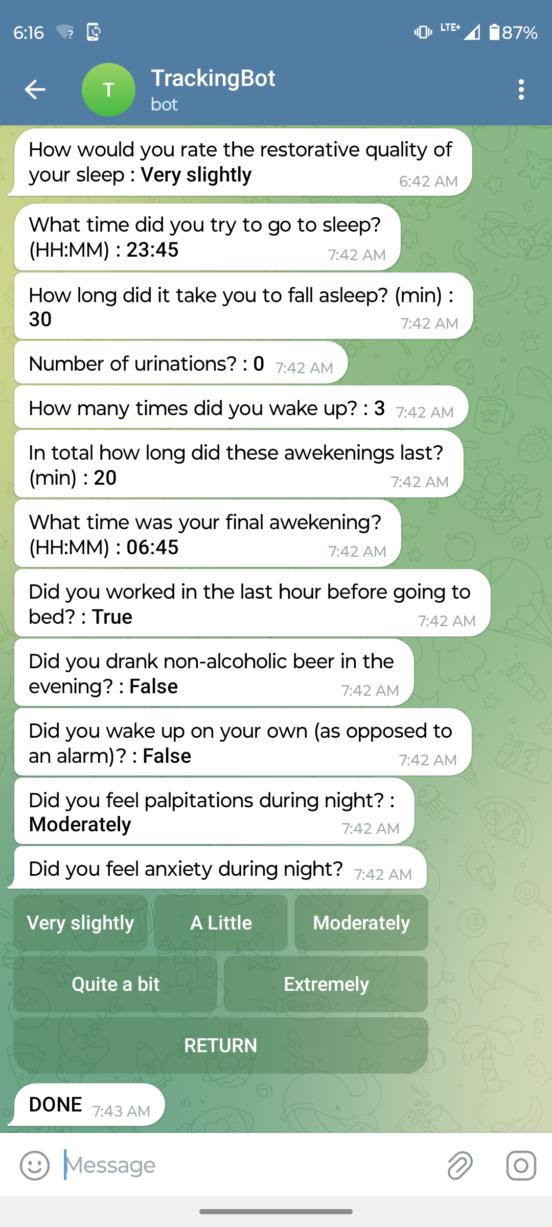
The telegram bot collects the data and sends it via API into the AirTable database. New surveys can be rapidly added or modified in a simple configuration file. In the figure below you can see a configuration of a simple survey that allows me to rapidly enter lung function test results after I obtain them from the SmartOne device, which unfortunately does not offer an API for automated data downloads:
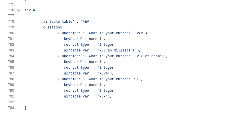
As a bonus, the Telegram survey also acts as a reminder for me to take the lung test every Saturday, as it’s scheduled weekly.
Fitbit
I use the Make no-code platform to automate daily data exports from Fitbit to Airtable. Here’s a screenshot of the Make scenario I set up:
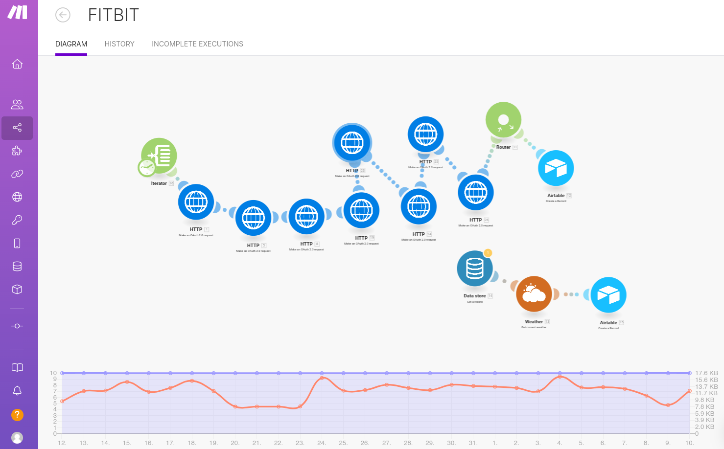
This was easy to set up, and in an ideal world, I’d prefer to use this solution for automating data collection from all sources. However, authentication protocols for some APIs have idiosyncrasies that I found difficult to handle using Make. I was initially able to access Withings data this way, but after their latest API update, it stopped working. While I’m not an expert on web authentication, it’s possible that someone more skilled could make it work. If you do, feel free to share! The Make service costs about $10 per month to run. Unfortunately, Fitbit’s API doesn’t provide access to a few key variables, such as the Fitbit Sleep Score, which I still track manually (see bellow).
Polar & Withings
I use the Polar H10 belt during runs and the Withings Body Scale and BP monitor daily. Both devices offer REST APIs, but I wasn’t able to configure their authentication through Make, so I wrote Python scripts to pull the data instead. These scripts run daily on a cloud server, which also hosts the Telegram bot, costing about $10 per month.
Habits, Supplements, Nutrition, Medication, Exercise (other than running), HRV, Blood tests
For these categories, I haven’t yet found a satisfactory way to automate data entry. Each evening, I manually enter the data into Airtable, which takes about 10–15 minutes. Despite this, I find it efficient enough to track around 200 variables. Most days, I only need to log 15–30% of the manually tracked variables, making the process manageable.
The central database
I chose Airtable as the central database due to its intuitive user interface, which allows for efficient manual data entry and inspection—critical for a system that relies partially on manual input and evolves over time. Airtable also offers a powerful API for automated reading and writing operations.
For convenience, the data is split into smaller tables, all linked via the Date field. These tables are then merged into a single large table when imported into the analytical platform. Below is an example of a table holding HRV data:
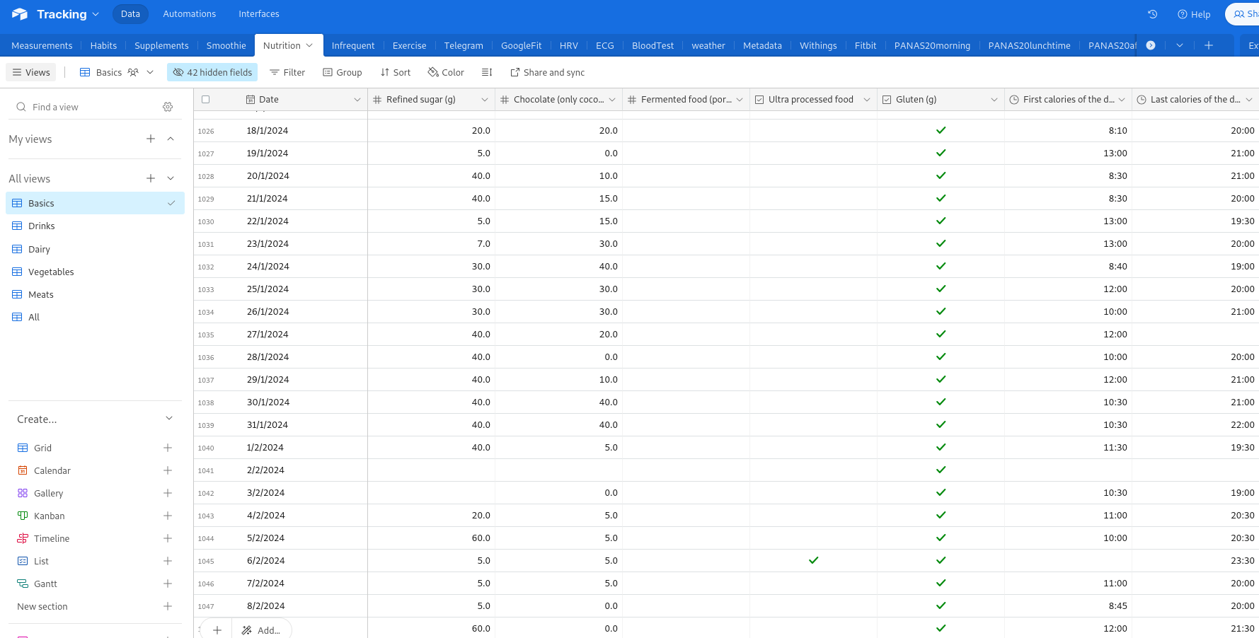
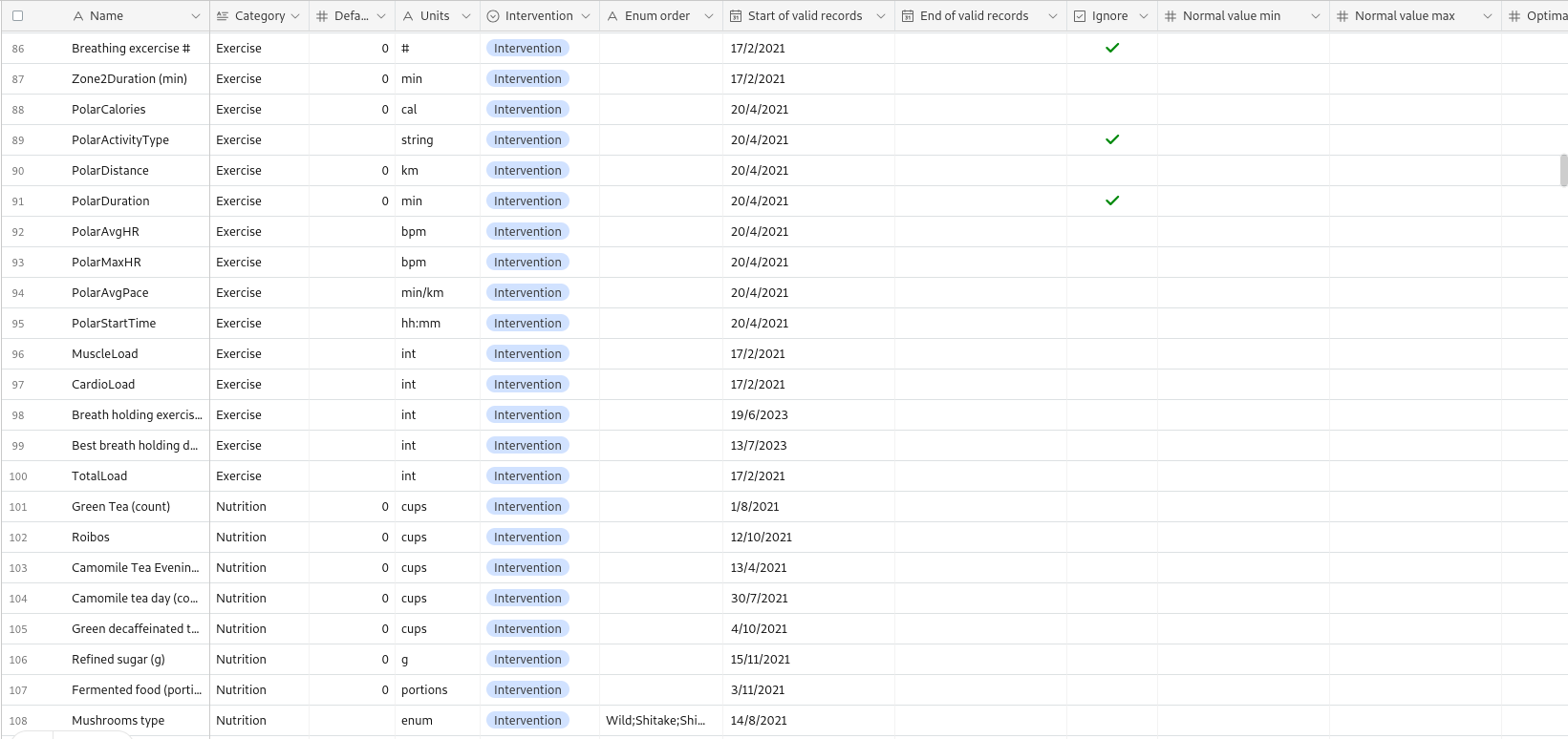
A key feature of the system is the Metadata table, which stores information about each tracked variable, facilitating automated analysis:
The analytical platform
The analytical platform is written in Python using numpy, scipy libraries for data analysis, and pandas DataFrames for data representation. The user interface is written in Bokeh library, which allows rapid development of user interface and visualization of data using web technology directly in Python. The app is organized into multiple tabs, each offering different inspection or analysis of data. Let me briefly introduce each of them:
Exploratory paired analysis tab
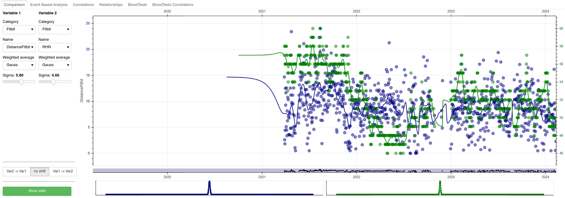
This tab allows for basic data exploration. Users can select two variables to compare, view their temporal relationship, apply filters, and even shift data to account for delayed effects (e.g., how a supplement taken one day impacts sleep the next). The scatter plot and Pearson correlation between the two variables are displayed for further insights.
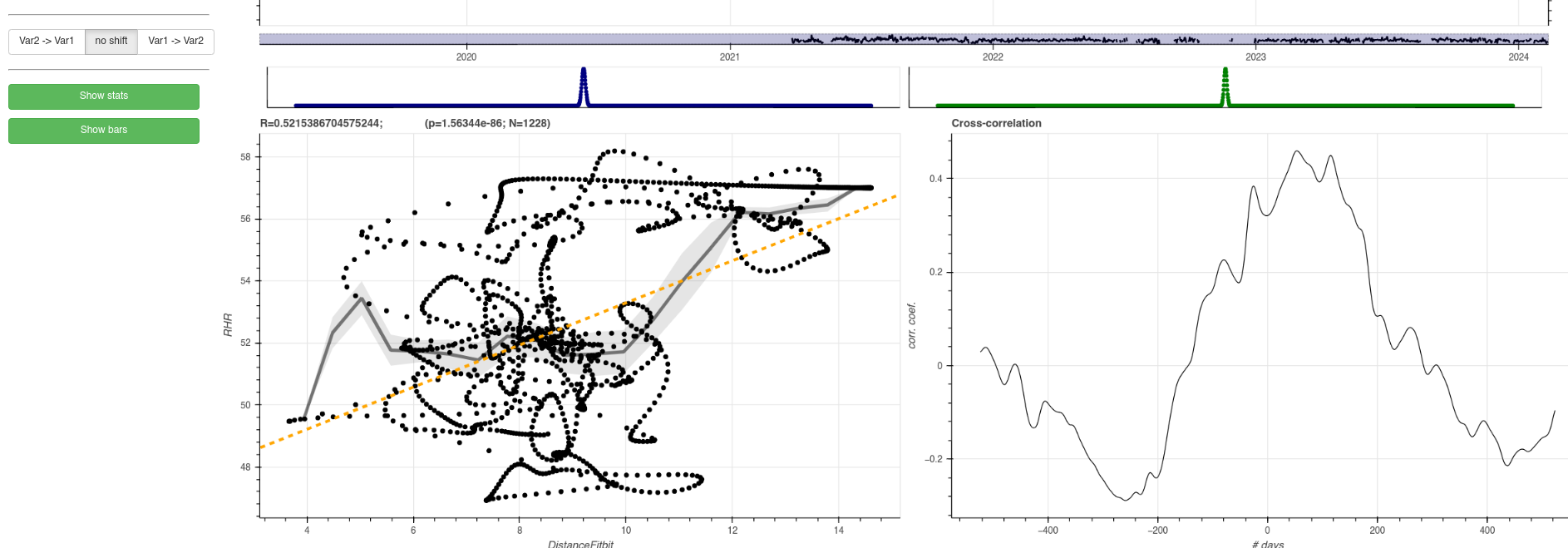
Note that in this case the time points look like ‘sitting on trajectories’ due to the Gaussian smoothing filter that is switched on for both variables. On the bottom right, the user can see the cross-correlation between the two variables, that can reveal a delayed relationship between the two variables.
Semi-automated correlation analysis tab
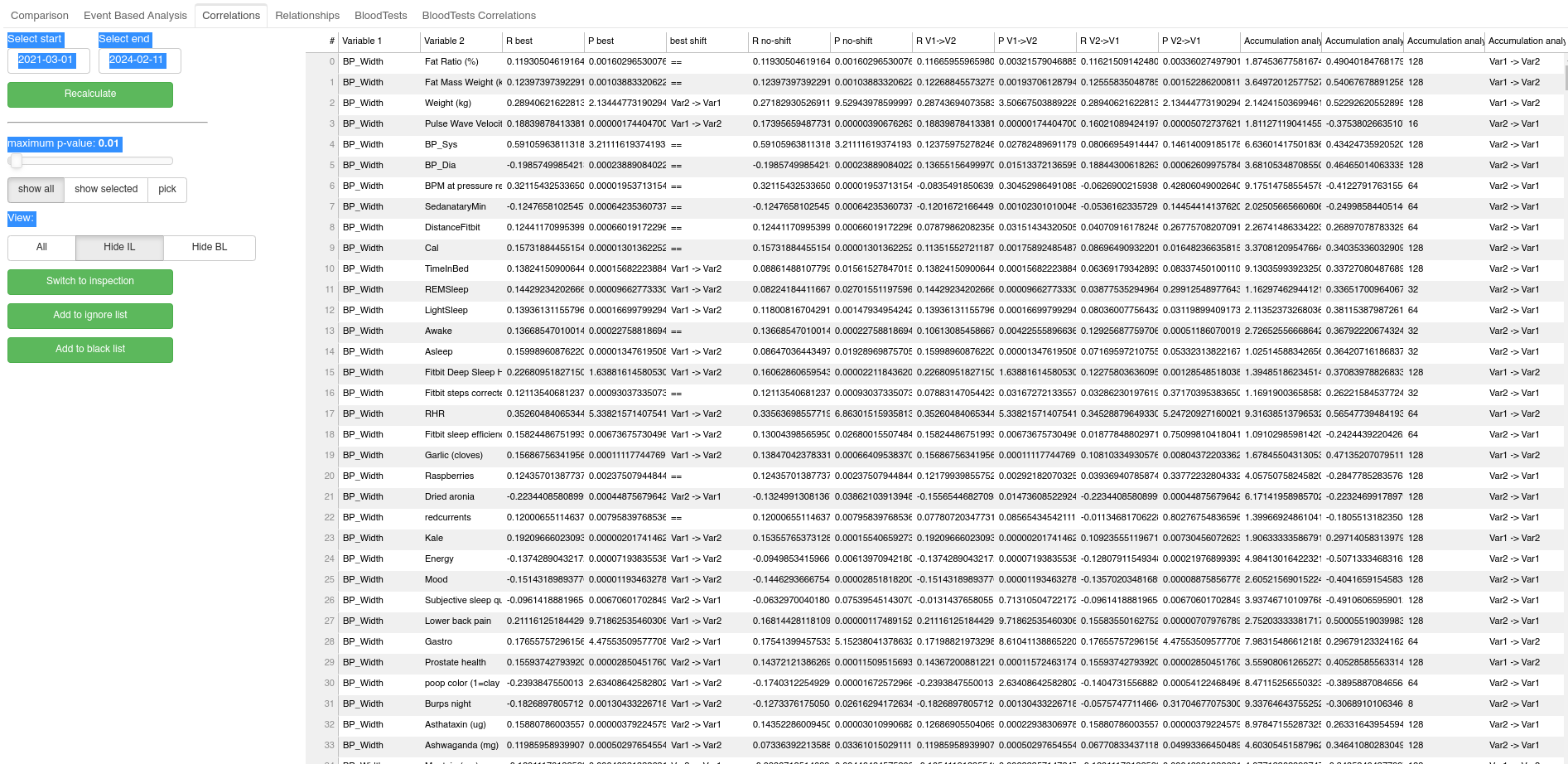
This tab allows for semi-automated data analysis based on simple Pearson correlations. Essentially, for all pairs of variables Pearson correlation is calculated and the results are displayed in one large table. User can filter the results in the table by restricting entries only to those that pass certain statistical significance threshold (p-value provided by the Pearson correlation). User can also restrict the table only to relationships which contain predefined variable. Finally the user can sort the table based on the statistical significance, or the correlation coefficient to easily spot the dominant relationships. The correlation is calculated also when the data in the given pair is shifted by one day in each direction relative to each other. The shift with the highest correlation is then reported. There is also a button the lets me quickly switch to exploratory paired analysis of the given pair of variables.
Finally, it is reasonable to assume that a common non-linear relationship between variables will be due to accumulation of the impact of certain interventions, such as the aforementioned accumulation of some supplemented molecule over time. To take this into consideration, for each pair of variables A and B, I also perform correlation between B and transformation of the variable A, where for a given time-constant T=(2,4,8,16,32,64,128,256 days) days calculate the accumulated variable A. The results of this accumulation analysis (in the form of resulting pearson correlations) are then listed in additional columns of the table, and user can sort the table based on them.
Relationship tab
Many relationships between variables are trivial, and would clog the automated analysis as they would constantly pop out as the most significant relationships, even if they are uninteresting. A perfect example is a Fitbit Sleep Score vs. Deep Sleep duration, as the FSS formula uses deep sleep, and hence the two are highly correlated. To address this issue, I allow user to keep a list of variables to ignore. This tab allows user to inspect the ignore list, and add or remove relationships from it.
Blood tests tab
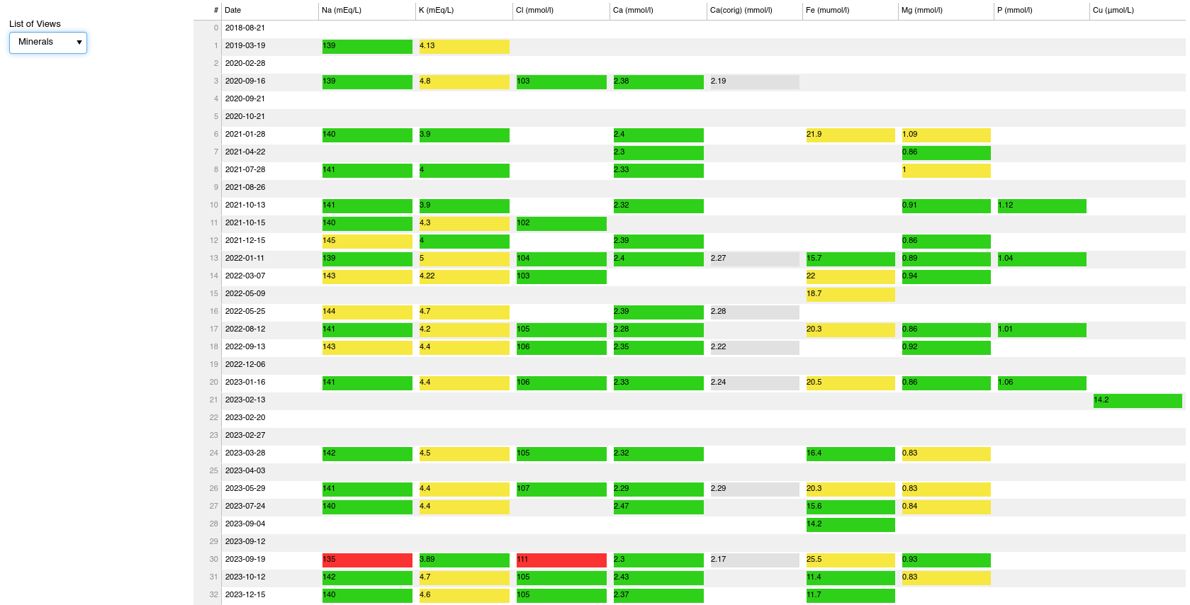
This tab allows me to track the evolution of my blood biomarkers. I take blood panels about every 2-3 month. In this panel I can pick a category of biomarkers, and then see in a table how all the biomarkers that belong to the category evolve in time. I have compiled from literature the normal (marked as yellow) and crucially also the optimal ranges (marked as green), defined as the range within which the given biomarker level predicts lowest all-cause mortality.
Under development
Few more tabs are under development:
- I am developing event-based analysis that will be able to detect the impact of low-frequency interventions that cause a step change to other biomarkers (think of a single, or occasional, short course of senolytics that cause improvement of some aspect of the aging process). Such relationships are difficult to detect through simple correlations.
- I am developing a multivariate analysis in the form of a novel machine-learning model that will be able to better detect the interactions of multiple interventions and their impact on the aging process.
- In future I hope to apply more rigorous techniques from the domain of causality detection to advance my analysis from testing association to testing causation.

Leave a comment
Your email address will not be published. Required fields are marked *